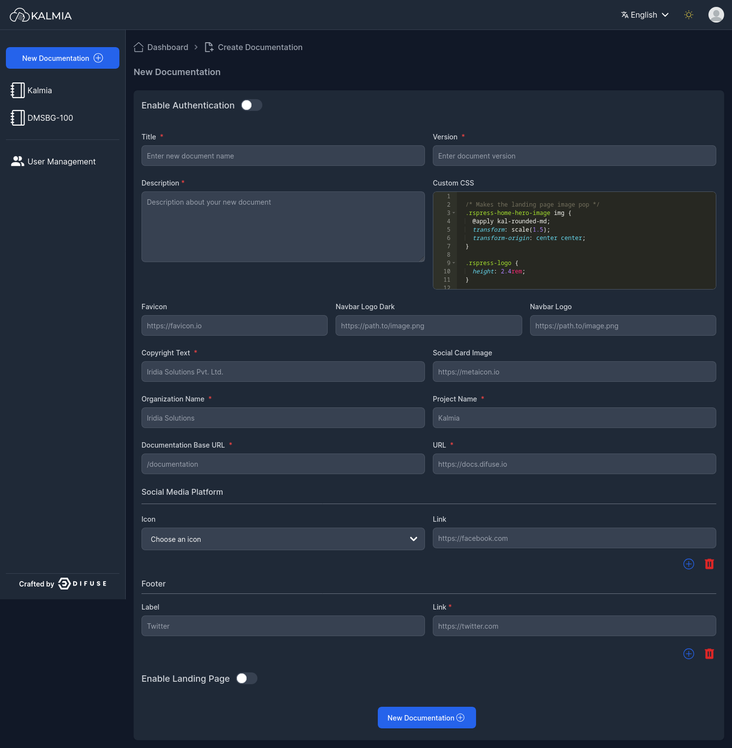
.rspress-home-hero-image img {
  @apply kal-rounded-md;
  transform: scale(1.5);
  transform-origin: center center;
}

.rspress-logo {
  height: 2.4rem;
}


:root {
  --rp-nav-height: 72px;
  --rp-sidebar-width: 320px;
  --rp-aside-width: 268px;
}

:root {
  --rp-c-bg: #ffffff; /* Main Background color */
  --rp-c-bg-soft: #f9f9f9; /* Features div background color*/
  --rp-c-bg-mute: #f1f1f1; /*Navbar/Sidebar active & hover background color */

  --rp-c-divider: rgba(60, 60, 60, 0.29);
  --rp-c-divider-light: rgba(60, 60, 60, 0.1);

  --rp-c-text-1: #213547; /* Tile description ,Learn more button ,Navbar ,Doc content ,Sidebar:hover text color  */
  --rp-c-text-2: #031159; /* Feature description, Navbar icons, Serach placeholder, Sidebar text color */
  --rp-c-text-3: rgba(60, 60, 60, 0.33);
  --rp-c-text-4: rgba(60, 60, 60, 0.18);

  --rp-c-text-code: #476573;
  --rp-c-text-code-bg: rgb(153 161 179/ 0.1);

  --rp-c-brand: #031159; /* Title, border ,doc content #(symbol) , active version color*/
  --rp-home-hero-name-background: -webkit-linear-gradient(120deg, var(--rp-c-brand) 30%, #aebbfc); /*title starting gradient color*/
  --rp-home-mask-background-image: conic-gradient(from 180deg at 50% 50%, var(--rp-c-brand) 0deg, 180deg, #8295fb 1turn); /*image gradient end color*/
  --rp-c-brand-light: #031159;/*Get started button starting gradient color */
  --rp-c-brand-lighter: #66c2ff;
  --rp-c-brand-dark: #031159; /*Get started button ending bg gradient color , Active Navbar & Sidebar text color */
  --rp-c-brand-darker: #005fcc;
  --rp-c-brand-tint: rgba(127, 163, 255, 0.16);

  --rp-c-gray: #8e8e8e; /* Search icon color, (ctrl k) text in search color) */
  --rp-c-gray-light-1: #aeaeae;
  --rp-c-gray-light-2: #c7c7c7;
  --rp-c-gray-light-3: #d1d1d1; /*Learn More button border color */
  --rp-c-gray-light-4: #e5e5e5; /*Learn More hover bg color*/
  --rp-c-gray-light-5: #f2f2f2; /*Learn More button bg color*/

  --rp-c-dark: #000000;
  --rp-c-dark-light-1: #2f2f2f;
  --rp-c-dark-light-2: #3a3a3a;
  --rp-c-dark-light-3: #4a4a4a;
  --rp-c-dark-light-4: #5c5c5c;
  --rp-c-dark-light-5: #6b6b6b;

  --rp-radius: 1rem;
  --rp-radius-small: 0.5rem;
  --rp-radius-large: 1.5rem;

  --rp-c-link: var(--rp-c-brand-dark);
}

/* Dark mode */
.dark {
  --rp-c-bg: #23272f; /* Background color */
  --rp-c-bg-soft: #292e37; /* Features div background color*/
  --rp-c-bg-mute: #343a46; /*Navbar/Sidebar active & hover background color */
  --rp-c-bg-alt: #000;

  --rp-c-divider: rgba(84, 84, 84, 0.65);
  --rp-c-divider-light: rgba(84, 84, 84, 0.48);

  --rp-c-brand: #7188fa;  /* Title, border ,doc content #(symbol) , active version color*/
  --rp-home-hero-name-background: -webkit-linear-gradient(120deg, var(--rp-c-brand) 30%, #ffffff); /*Title starting gradient color*/ /* changed */
  --rp-home-mask-background-image: conic-gradient(from 180deg at 50% 50%, var(--rp-c-brand) 0deg, 180deg, #8295fb 1turn); /*Image gradient end color*/ /* changed */
  --rp-c-brand-light: #7188fa; /*Get started button starting gradient color */
  --rp-c-brand-lighter: #66c2ff;
  --rp-c-brand-dark: #7188fa; /*Get started button ending bg gradient color , Active Navbar & Sidebar text color */
  --rp-c-brand-darker: #005fcc;
  --rp-c-brand-tint: #313238;

  --rp-c-text-1: rgba(255, 255, 255, 0.87);
  --rp-c-text-2: rgba(235, 235, 235, 0.56);
  --rp-c-text-3: rgba(235, 235, 235, 0.38);
  --rp-c-text-4: rgba(235, 235, 235, 0.18);

  /* Will be used in overview page */
  --rp-c-text-code: #c9def1;

  --rp-c-link: var(--rp-c-brand-light);
}

:root {
  --rp-z-index-local-nav: 10;
  --rp-z-index-nav: 20;
  --rp-z-index-backdrop: 30;
  --rp-z-index-sidebar: 40;
}

:root {
  --rp-shadow-1: 0 1px 4px rgba(0, 0, 0, 0.02), 0 1px 0 rgba(0, 0, 0, 0.06);
  --rp-shadow-2: 0 3px 12px rgba(0, 0, 0, 0.07), 0 1px 4px rgba(0, 0, 0, 0.07);
  --rp-shadow-3: 0 12px 32px rgba(0, 0, 0, 0.1), 0 2px 6px rgba(0, 0, 0, 0.08);
  --rp-shadow-4: 0 14px 44px rgba(0, 0, 0, 0.12), 0 3px 9px rgba(0, 0, 0, 0.12);
  --rp-shadow-5: 0 18px 56px rgba(0, 0, 0, 0.16), 0 4px 12px rgba(0, 0, 0, 0.16);
}